Case study coming soon!
Campaign: Back to School '24

Something about back to school always evokes such nostalgia. So for OLLY’s Back to School ‘24 campaign, we went back—way back.
Think gel pens, Tamagotchis, jelly shoes and all sparkly everything everywhere. Back to when you had to turn on the family desktop with your big toe so you could surf the World Wide Web and stay up way too late talking to your friends on Instant Messenger—all without leaving the “computer room.”
The Task
Back to School is one of OLLY’s most important (and fun!) tentpole campaigns of the year as we delight consumers and help them prepare for a busy school year ahead.
The goal every year remains the same—to deliver a fresh, cohesive campaign; build OLLY’s brand recognition; and lean into the relatability of the chaos this time of year to drive sales.
-
The Back to School campaign is in the unique position of building off previous years’ learnings, but with that comes the challenge of making sure we stay relevant and return with a smarter, more effective campaign.
For Back to School ‘24, we threw it back to the 90’s, which hit a sweet spot for two different OLLY consumer groups: nostalgic millennial parents and trendy Gen Z students.
My Role
As channel lead, I met with Product, Marketing and Brand stakeholders to learn what worked last year and what didn’t. I stayed close with channel owners to understand best practices and worked in tandem with my design counterpart to tailor channel content that fit our overall campaign. Our small but mighty team delivered on 58 Briefs in 16 weeks. That's a 28% growth in brief intake vs PY, with the same headcount.
-
Our creative team examined last year’s ways of working and implemented production optimizations and design system updates prior to campaign start. This made it possible for copy and design to seamlessly concept and iterate in parallel, expediting timelines and maintaining version control.
The 90’s had so much slang, which, rad, but had the potential to go too far out. I went on several copy explorations to fine tune what retro references would connect without being dated (or induce eye rolls).The 90’s had so much slang, which, rad, but had the potential to go too far out. I went on several copy explorations to fine tune what retro references would connect without being dated (or induce eye rolls).
I established a copy hierarchy that balanced nostalgia with our message: OLLY supplements make getting back into a school year routine easy peasy. We’d use this system to iterate across different channels and writers, a total lifesaver when executing for Paid Social.I established a copy hierarchy that balanced nostalgia with our message: OLLY supplements make getting back into a school year routine easy peasy. We’d use this system to iterate across different channels and writers, a total lifesaver when executing for Paid Social.
Dot Com

Inspired by Geocities and everyone’s budding passion for graphic design, we really went for it on our landing page. The tubular background and shiny holographic stickers were in line with the campaign’s overall look-and-feel. And it wouldn’t be an authentic 90’s website without paying homage to a certain Operating System’s application windows and chatty mascot. ;)

Remind you of a certain mascot?
View static webpages here: Launch, Refresh 1, Refresh 2 and 3
To balance the rad design, copy focused on conversion by speaking to product benefits. We peppered in that flippant 90’s tone throughout the page, leaving Easter eggs on the windows modules, but prioritized on the need state of each supplement to entice readers to click “Shop.”
As the campaign progressed, we had three copy refreshes total to evolve with the: preparation, purchase and post school year phases. For our last iteration, aimed at college students, we completely updated the website, from copy to graphic design and product offerings.
Gen Z Activation: Tinder & Chegg
“Back to school” includes college. With the campaign’s late-90's-meets-Y2K art direction, we had the challenge of connecting with our secondary audience who weren’t even conscious during this decade. No problemo, dude.
Visually, we struck a vibrant graphic treatment that balanced both nostalgia (for millennials) and trend (for Gen Z) and let our headlines shine. We bet big on bold, current and meticulously pointed copy that felt native to the users on our placements: Chegg (a study support website), Tinder (targeting adults in their early 20s) and Reddit.


The results? People couldn’t stop swiping right on OLLY. Between our Tinder branded profile card and a native display card, we garnered:
3.5MM impressions (203K added value, ~5% AV)
Our branded profile card earned
2.9% engagement rate. Tinder benchmarks are 1.5-2%
50% message open rate, on par with top end of benchmarks 40-50%
And our native display card earned
2.9% engagement rate. Tinder benchmarks are 1.5-2%
**3.7% engagement rate specifically for 18 year olds**


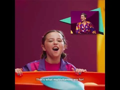
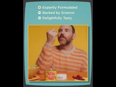
Paid Social: Motion & Static
View fullsize
![]()
View fullsize
![]()
View fullsize
![]()
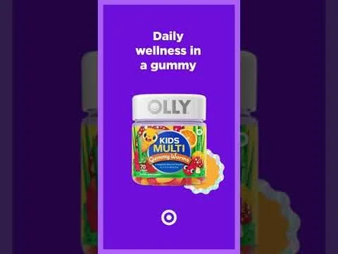
OLLY’s Back to School TV spot was the bomb dot com. So we absolutely repurposed it for our paid social ads, which are just mini commercials if you think about it.
To follow best practices and avoid creative fatigue, we applied the following parameters on our motion and static ads on Meta, Snapchat and Pinterest:
Three different audiences: New to Brand, Retargeting and Remarketing
Two messaging tracks and design treatments per funnel placement
Three creative refreshes (both visual and copy)
Videos were cut into :30 sec and :15 sec each


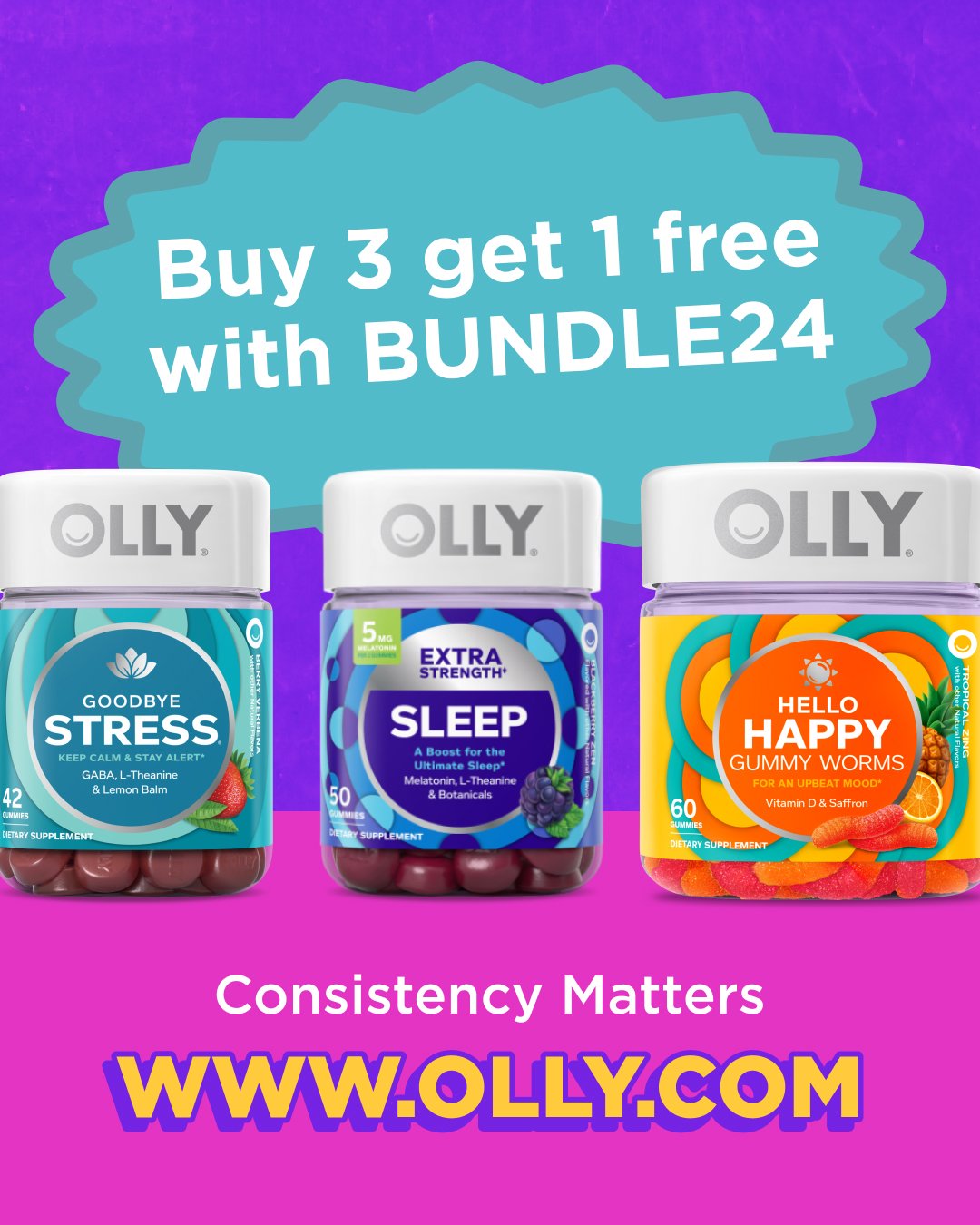

For our paid static assets, we leveraged still and on figure photography, product vectors and graphic design to create variety and avoid the dreaded creative fatigue. This incredibly inventive and resourceful approach made:
64 motion ads
285 Meta static ads
30 Pinterest static ads
5 on-ad polls
and the countless social share captions our copywriters wrote for each.